In March 2020, a friend of mine reached out to me about helping him create an application. The goal of this project was to create a full system for connecting businesses with influencers for the purpose of social media marketing.
Problem Statement
Most influencer marketing applications are expensive and require a lot of manual work from the user and service provider to match influencers with businesses. Influencers and businesses want an easy way to connect with each other to help promote their brands.
Project Planning
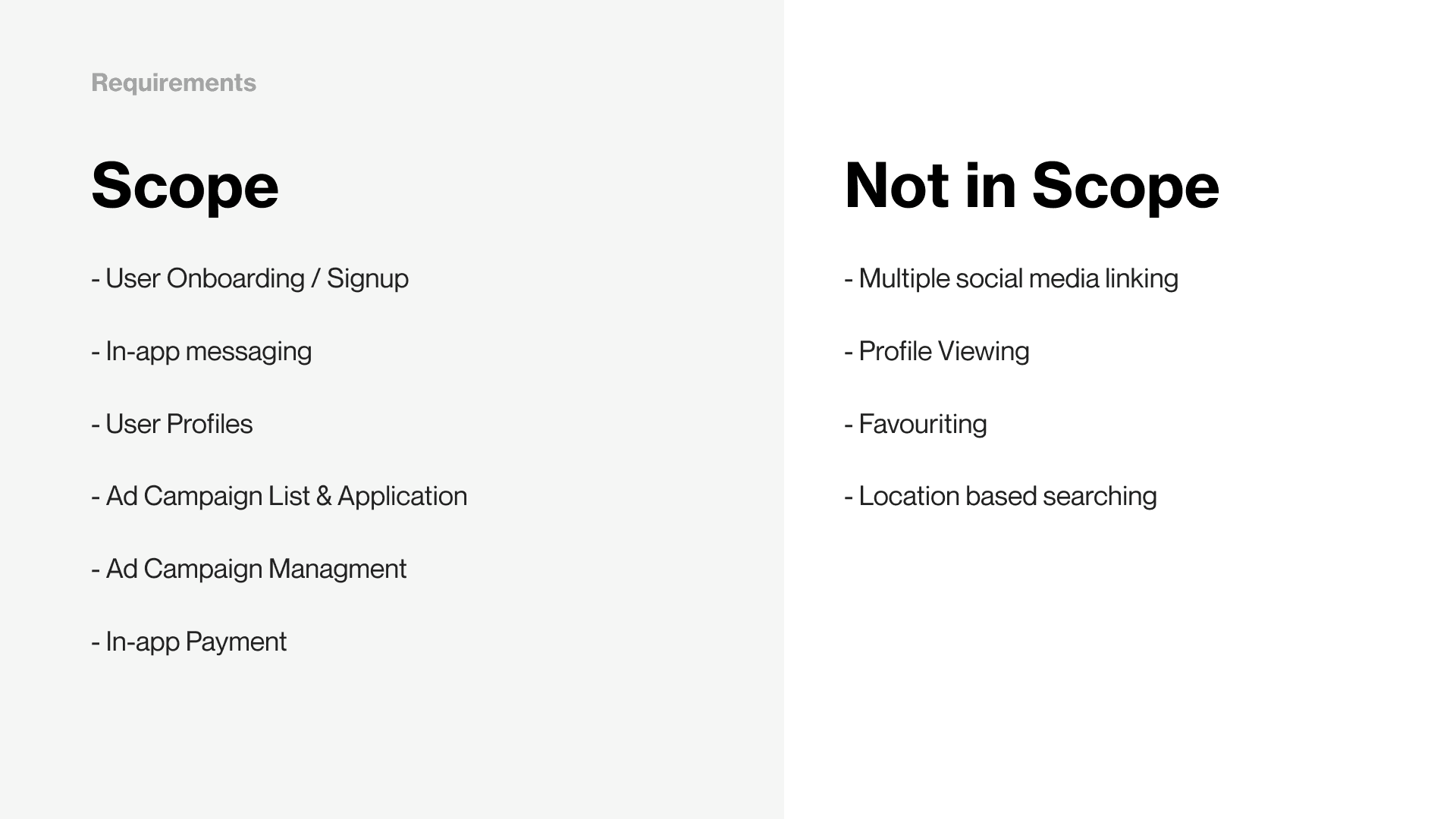
Starting off the team and I discussed what this product looked like. We went through the exercise of defining the project scope and what features are must-have, should have, could have, and won’t need through an MSCW exercise. The basic premise of this was to define the product and trim features where ever possible. It quickly became evident that this was not a small app. The application that was being proposed was a very large undertaking, but there was a clear goal in mind.
We primarily focused on creating the project as a mobile platform to provide the simplest experience to businesses and influencers. At the time we also considered the two primary users of this application to be Brands (businesses) and Creators (influencers).
One major challenge that I faced, as a UX designer on this project, was that initially, we did not have anyone dedicated to product management. These responsibilities in part fell to me, and this allowed me to document the product plan. This was beneficial to do, and by doing so I was able to maintain focus on what needed to be done in order to complete the project.
User Personas
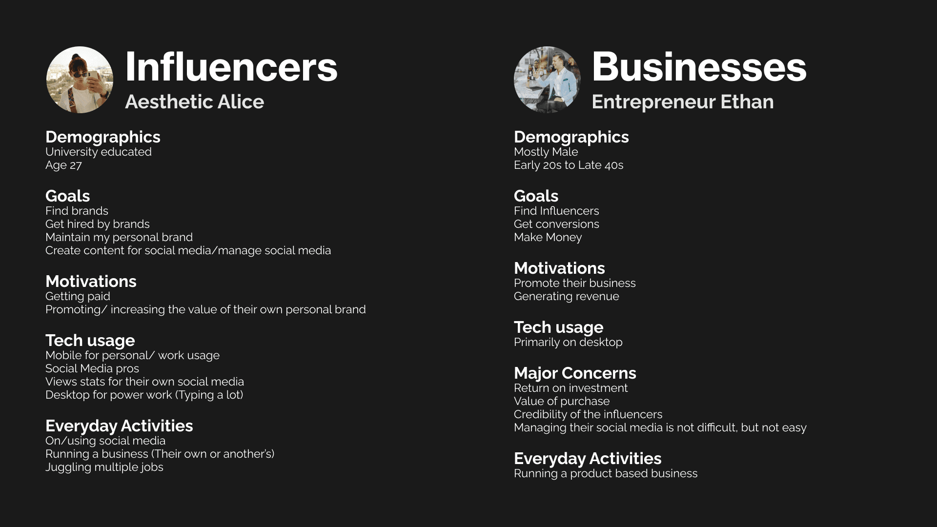
Throughout the project, two primary user personas were identified that needed to be focused on. At its most based the two groups would be considered the Influencers and Businesses. The Influencers, are social media professionals who monetize their services on social media the generate income. Businesses are considered small business owners who run their own brand’s social media to promote products and their brand.
A unique common goal between these two user groups is that they are both highly motivated by promoting their brands. Both the influencers and businesses own brands, and they are looking for a partner that pairs with their unique brand. Additionally, as the business objectives expanded to feature celebrity athletes that play in Nation American leagues as well as the Olympics.
Design & Prototyping
Colors
Typography
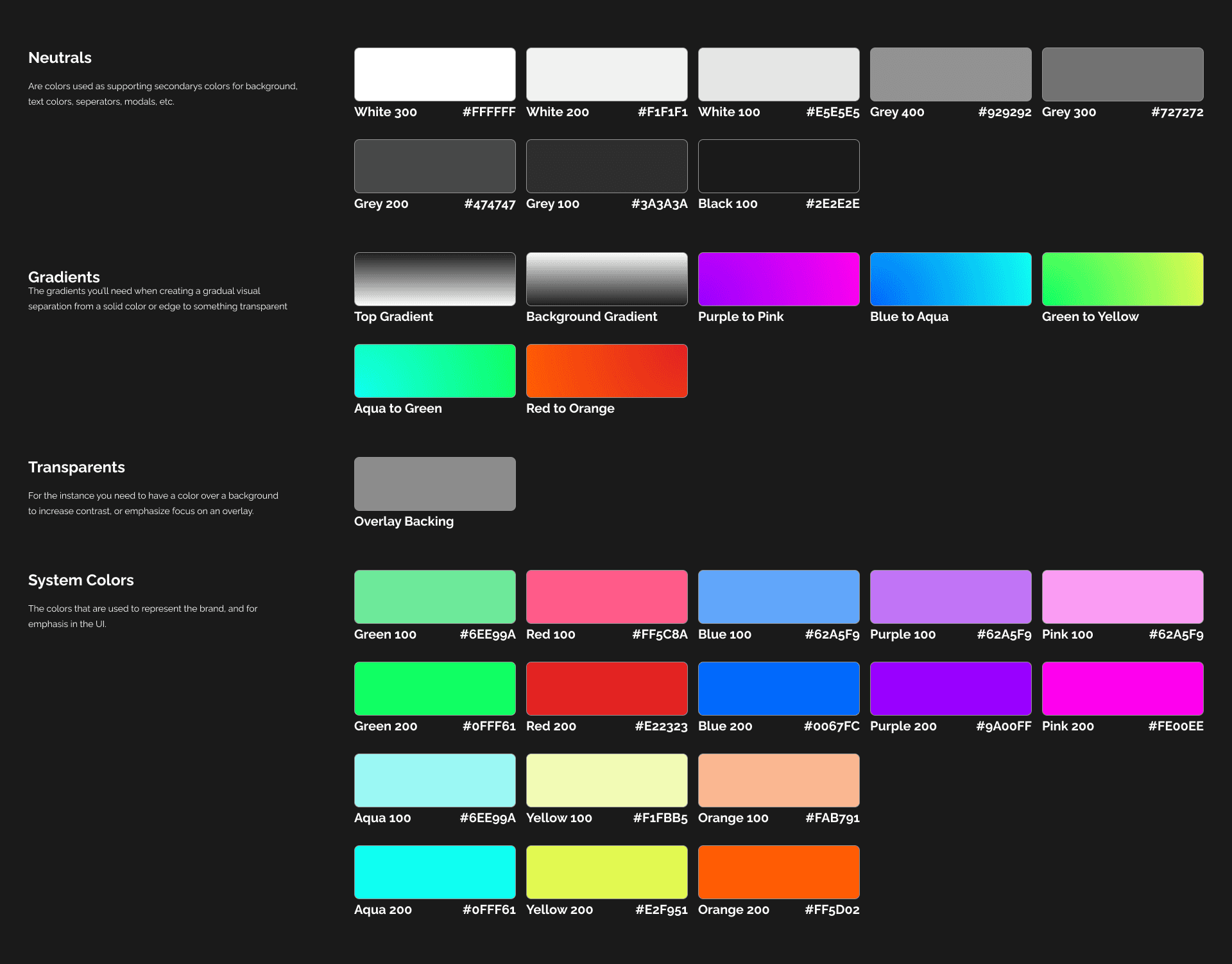
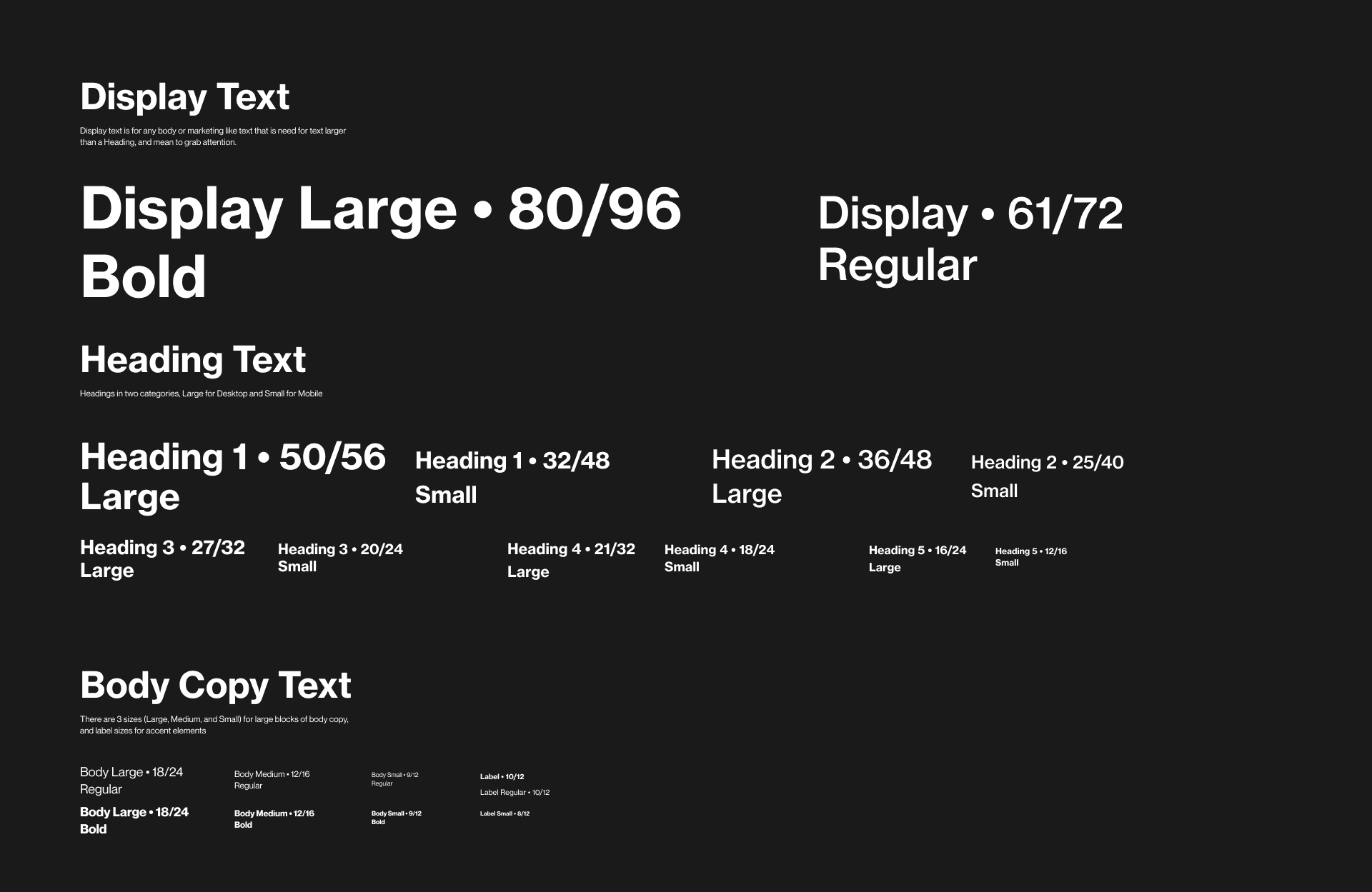
Working in Concepts and the Figma app I was able to sketch out key screens, design user flows, and create a design system that could be consistently applied throughout the application. As the key screens were continuously refined I began assembling them into a medium-fidelity prototype that I could show to stakeholders and evaluate with users in a series of user tests.
User Testing
I developed a user testing protocol with the intention of testing the user onboarding flow and then evaluating the two separate experiences for the two primary users (Influencers and Businesses). In the user tests, 5-7 participants were selected for the two groups of primary users. They completed a pre-test questionnaire, a task evaluation exercise of 5 tasks related to the primary user flows, and a post-test questionnaire.
An extremely revealing piece of information that the user testing revealed was that business users were particularly thrown by a mobile interface being presented for their test. As a business using their primary work devices is a laptop or desktop computer rather than a mobile phone. This was enough to pivot the leadership team to start the design of the web application for business users.
Key Findings
The influencer application performed well during user testing. The influencer app had an average System Usability Scale score of 93.5/100. The influencer application performed well with minor usability issues being found such as:
Iconography was not always clear to the user and should be paired with a label.
Writing a pitch could be difficult if you cannot easily go back to review the description of the Ad Campaign you are applying for.
A key path to achieving a conversation via the messaging feature would be nice to have when viewing a job posting.
It became clear the business application was not properly meeting the needs of the participants. The Brand Dashboard had an average System Usability Scale Score of 67.5%. Most importantly these findings were highlighted:
Business users looking to find an influencer primarily worked on a desktop or web applications on a desktop when conducting work activities rather than on a mobile phone.
The concept of influencers applying to work with businesses was well received, but a subset of users was critical about not being able to simply hire someone.
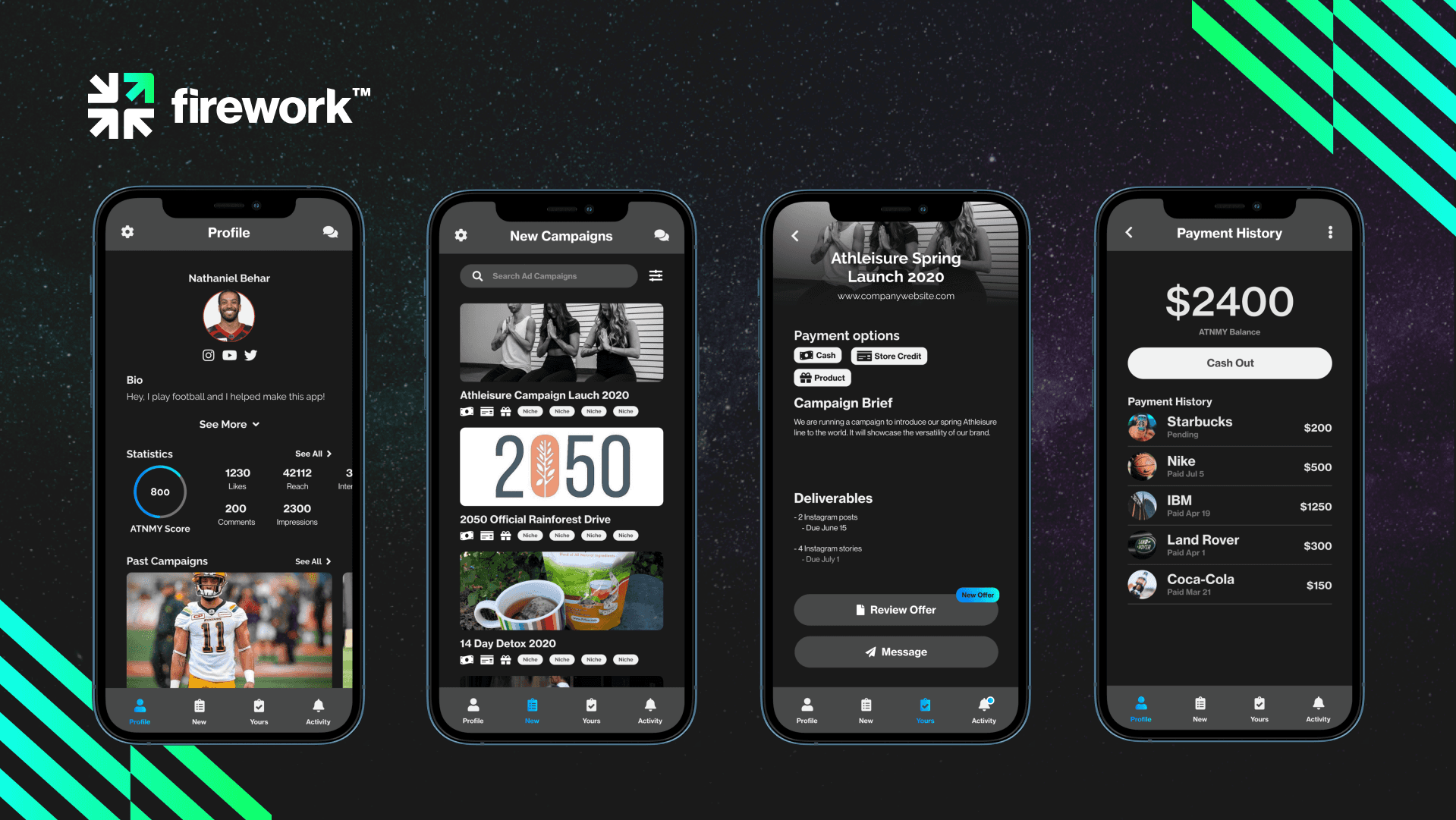
The prototypes payment functionality was not clear to the user.
Rebranding
As the project continued the branding of the application that started as ATNMY, which was rebranded to FireWork.
Final Result
The project was able to develop a mobile and web application. In addition to that, the company was able to secure $700,000 in venture capital for further design and development work. You can check out the website here!
