As a part of the YorkU UX certificate, a group of students and I were paired with a client. The client was a member of the Brandon Food Council and advocated for a new product to help with the community gardening services in the city of Brandon, Manitoba.
Problem Space
How might we design an engaging platform that helps to foster a sense of community collaboration, organizes accessible food information in one place, and provides a booking tool for community garden plots?
Background
Why: 11.2% of households in Manitoba experience food insecurity (national average 10.5%) 2016 Brandon Food Council found that 14.6% of respondents reported food insecurity in the previous year
Business Goals: When working with the client we were able to establish key goals for the project based on pain points, key metrics, and more using Lean Canvas.

Ultimately we wanted to design a platform that facilitates the connection between Brandon's gardeners and the city's community gardens.
This platform should include a request process for accessing community garden plots, with the goal of offering the city’s value gardening spaces, while helping to foster a more cohesive sense of community in Brandon.
Project Planning
We scheduled an initial kickoff meeting with our client to establish and define the goals for the project.
Our team then developed a comprehensive project proposal that outlined the project's vision, goals, and strategy, and presented it to the client for review and feedback. As the process continued we had two rounds of revisions and refinements
Based on our continued conversations with our client we were tasked with creating a mobile application that met the client's requirements. The initial request was broad and would have been best executed on multiple platforms. However, we focused on developing a mobile app for the primary consumers of the product.
Feature Set
Garden Management - For Garden Coordinators
Account Registration (accounts are free)
Sign-in & Sign-up
Online Payment
Accepting payments from gardeners
Garden Requests
Review applications
Upload garden contracts
In-app messaging
Gardener Access - For Gardeners
Google Maps view of available gardens
Community Garden descriptions
Name
Garden Coordinator
Water resources
Tilling
Allotment availability
In-app messaging to Garden Coordinators
Online Payment
View/select allotments
Purchase allotments
Sign a contract, Accept Terms & Service of the community garden
In-app Payment
Design Research
During the project's initial phase, we closely collaborated with the client to understand their business, industry, and target audience. We conducted extensive market research and competitor analysis to uncover trends and opportunities. This process helped us identify previously overlooked needs and objectives of the product's users. We then incorporated our findings to align with the client's business goals.
User Interviews
The team identified three key user groups we anticipate will experience an impact from the development of the Brandon Connect app, aimed at connecting gardeners with community gardens in Brandon, Manitoba.
The identified user segments are gardeners looking for community garden plots, garden coordinators handling registration and payments, and city administrators for Brandon, Manitoba. We interviewed 3 garden coordinators, 1 city administrator, and 2 gardeners.
User Personas
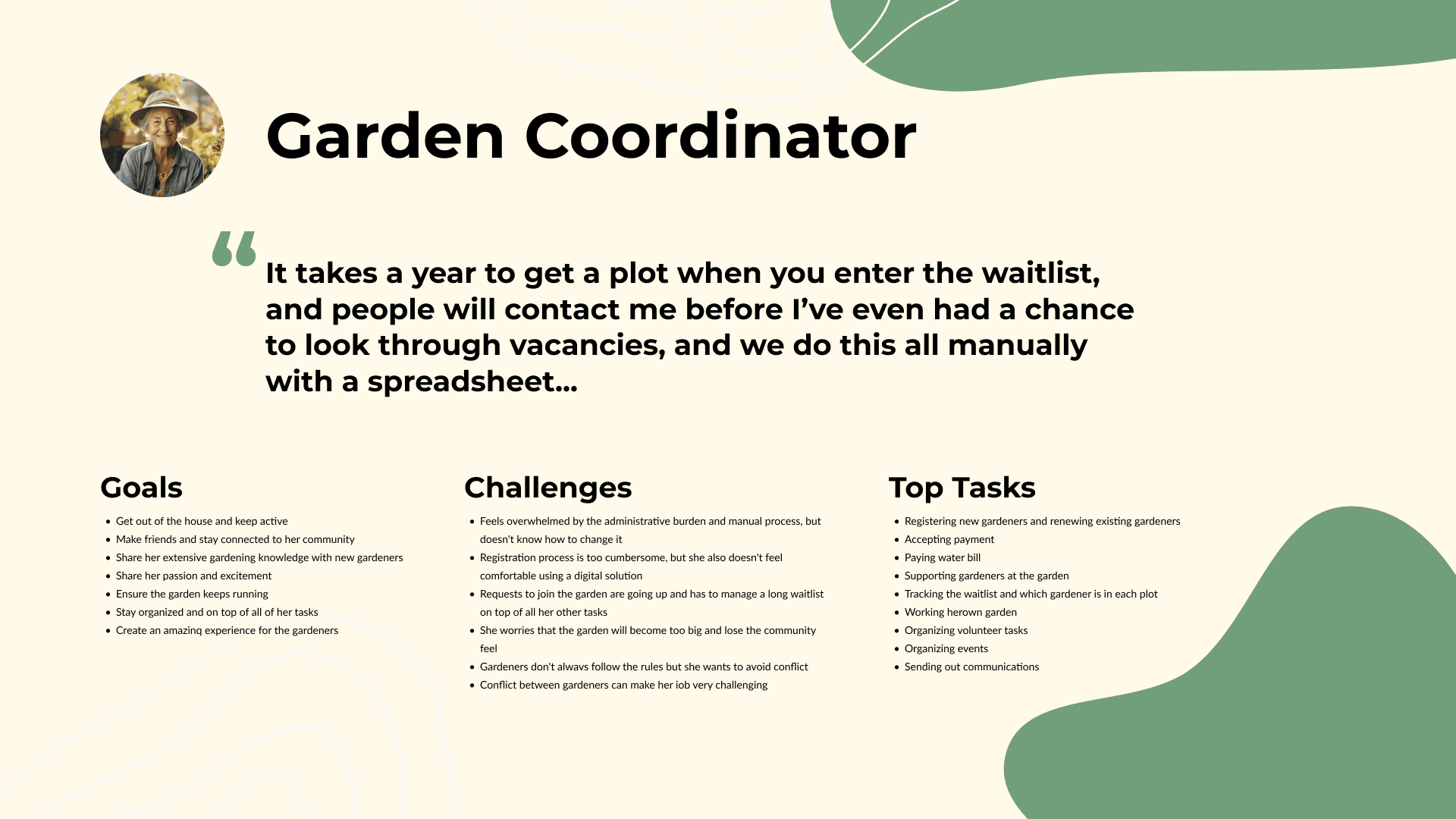
Based on our research, we developed three user personas to accurately represent these user groups.


User Flows
During the initial phase of the project, we worked closely with the client to gain a deep understanding of their business, industry, and target audience. We conducted thorough market research and competitor analysis to identify key trends and opportunities. Through this process, we were able to identify specific needs and objectives for the product’s users that had not previously considered. We then were able to incorporate our findings and align them with the client's overall business goals.


Sketches
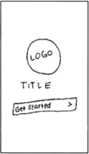
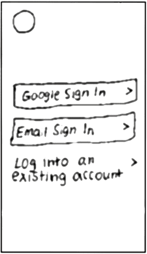
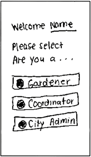
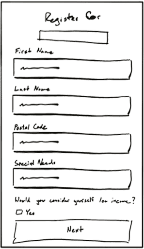
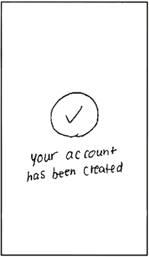
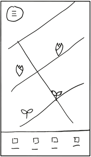
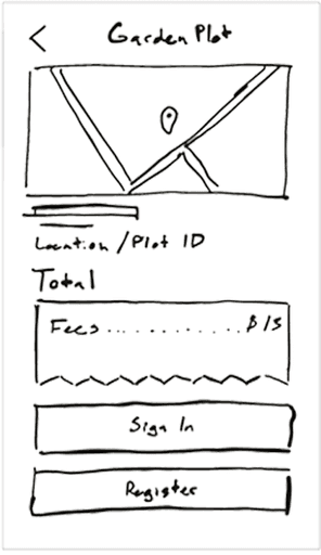
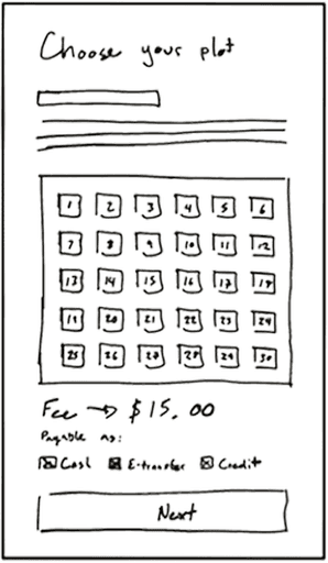
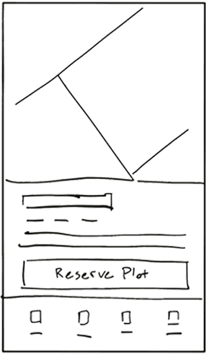
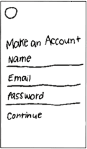
As part of the process of creating the visual design of the application, the team created dozens of sketches to begin conceptualizing the user interface of the Brandon Connect application.
Mid-Fidelity Wireframes
I started to create the medium-fidelity wireframes based on some of the initial sketches and aligned them with the user flows that I had created to help implement a robust interaction design.
Home Page Variations

Variation of the home screen of the application, our client had specifically requested the map interface for presenting the community gardens in Brandon.
Home Page Flow
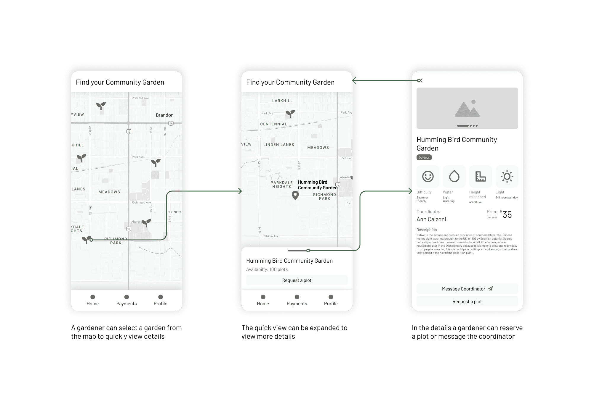
Outlining the interaction of the map, while accessing a mini description of the garden before presenting the full garden details page
Account Creation Flow

Our concept for un-authenticated users, as requested by the client, left the app open to explore, but required a sign-in/sign-up when requesting a garden plot

Our concept for un-authenticated users, as requested by the client, left the app open to explore, but required a sign-in/sign-up when requesting a garden plot

We considered allowing gardeners to be able to select their plot, but there was concern about how that would impact garden coordinators and their process for assigning plots
Payments Flow

We even designed a basic payment flow, with additional consideration for the 3 payment methods we identified during our research phase
Messaging Screens
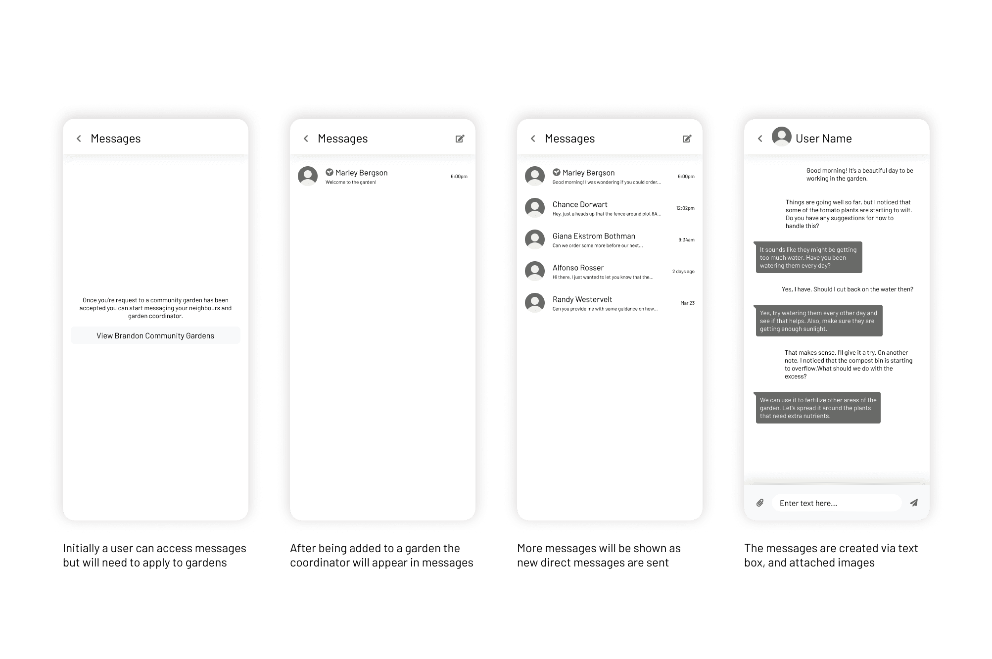
To facilitate communication between gardeners and coordinators we also designed a basic chat feature for the application
High-Fidelity Mockups
To improve the product's look, we reviewed our client's source material and studied competitors in similar markets. We experimented with colors and fonts to make it visually appealing to our target audience. We worked closely with our design team to make sure every detail was perfect. The final style is unique and enhances the user experience.
Home Page - Signed in

While signed in we decided to show additional UI elements, and enable more functionality for signed in users. Like messaging, applying for a garden plot, and payments.
Home Page - Signed out

While signed out the interface adapts to show less elements, while allowing the new user explore, and direct the user to sign up.
Sign Up
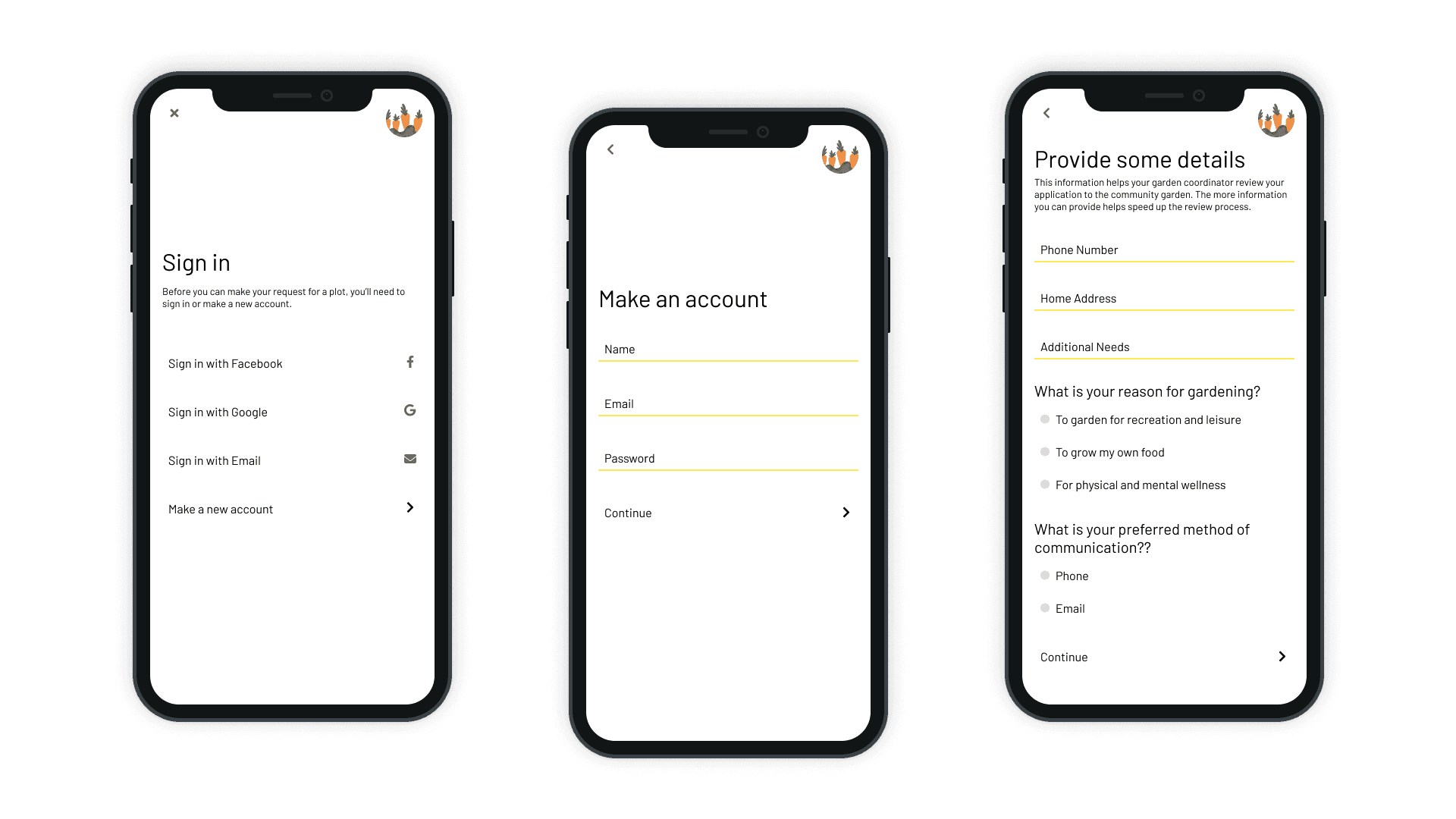
While signed out we decided to show additional UI elements, and enable more functionality for signed in users.

While signed out we decided to show additional UI elements, and enable more functionality for signed in users.
Payments

While signed out we decided to show additional UI elements, and enable more functionality for signed in users.
Messaging
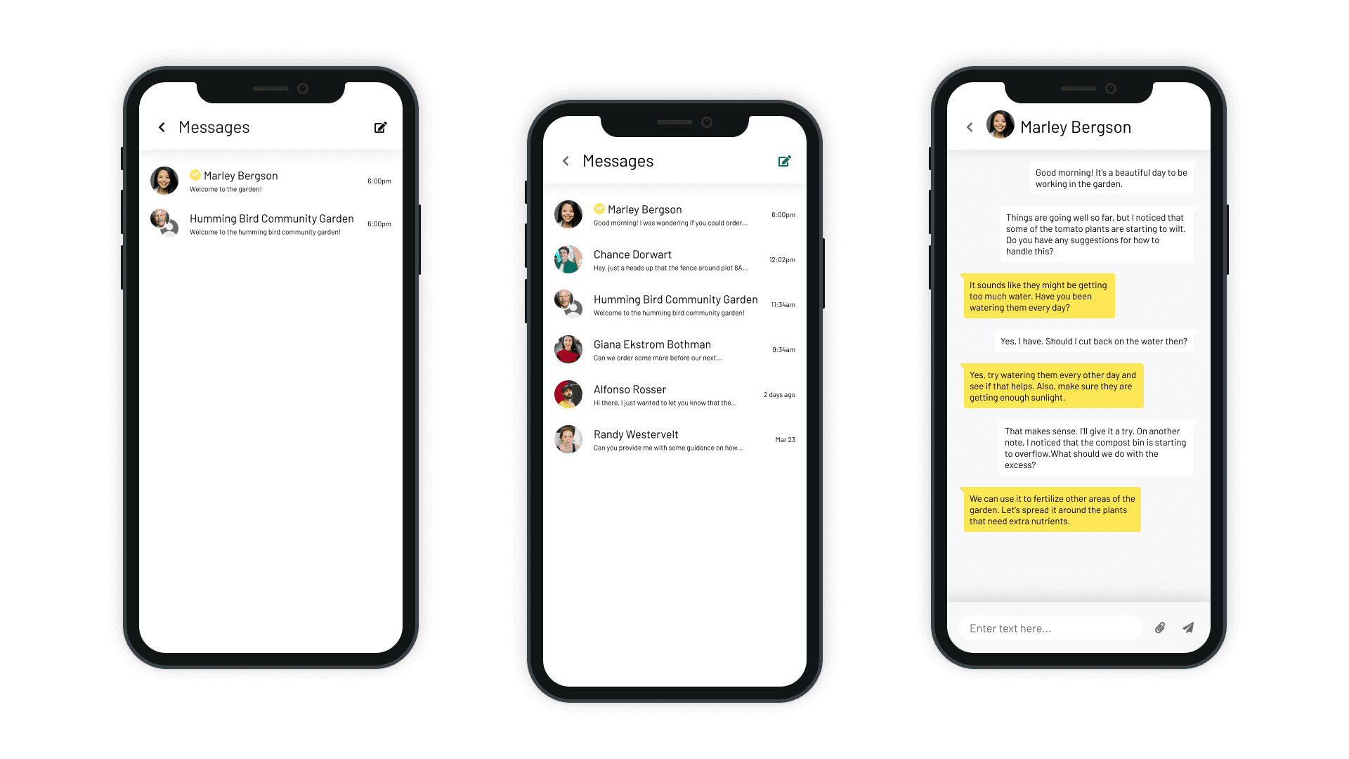
With communication being a key aspect of the experience messaging garden coordinators and other gardeners it was essential to provide group and direct messages.
